Most dividend investors focus on yield—that percentage next to a stock price. But yield tells you nothing about whether that payout will survive the next recession, the next earnings miss, or the next economic shock. What actually determines whether your dividend income keeps flowing is buried in the relationship between a company’s earnings and its payout. Understanding this relationship will save you from the most common mistake dividend investors make: buying a stock that looks safe but isn’t.
The dividend coverage ratio is the most underutilized metric in income investing. Unlike payout ratio, it accounts for actual earnings power relative to what you’re being paid. Here’s how this ratio works, where most people get it wrong, and how to use it to build a dividend portfolio that doesn’t collapse when the market turns.
What the Dividend Coverage Ratio Actually Tells You
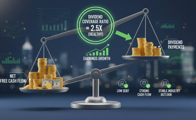
The dividend coverage ratio measures how many times a company can pay its current dividend from its net income. A ratio of 2.0 means the company earns twice what it pays out—it could theoretically cut the dividend in half and still maintain the payout. A ratio of 1.0 means it’s paying out every penny it earns, leaving zero margin for error.
This matters because dividends aren’t optional obligations. Unlike interest payments on debt, dividend cuts carry severe consequences: stock price drops, loss of investor trust, and ejection from indices that require consistent payouts. When a coverage ratio falls below 1.0, management faces an impossible choice—drain cash reserves, borrow money to maintain the payout, or cut the dividend and face the market’s wrath.
The distinction between coverage and payout ratio trips up many investors. Payout ratio divides dividends by earnings per share (EPS), which is mathematically similar to coverage ratio in its basic form. But here’s where it gets tricky: coverage ratio often gets calculated using free cash flow instead of net income, or using net income after adjusting for one-time items. The variations matter. A company reporting $1.00 EPS and paying $0.80 in dividends has an 80% payout ratio. But if that $1.00 includes a $0.30 gain from selling a division, the actual coverage from sustainable earnings might be closer to 1.0—dangerously close.
Always verify whether the coverage ratio you’re looking at uses GAAP earnings, adjusted earnings, or free cash flow. That distinction alone will save you from some bad outcomes.
The Formula Explained: EPS Divided by DPS
The basic formula is straightforward: divide earnings per share (EPS) by dividends per share (DPS). If a company earns $4.00 per share and pays $2.00 annually, it has a coverage ratio of 2.0. That’s the textbook definition, and it’s where most investors stop learning.
But the more useful calculation uses free cash flow per share rather than EPS. Net income includes non-cash items like depreciation and amortization, and it gets manipulated more easily through accounting decisions. Free cash flow—what actually flows into the company’s bank account after capital expenditures—tells you whether the dividend is genuinely affordable.
Consider a manufacturing company with $500 million in net income but $200 million in capital expenditures needed to maintain its facilities. Its free cash flow is $300 million. If it pays $400 million in dividends, the EPS-based coverage looks acceptable, but the free cash flow coverage reveals a problem. This happened at General Electric during its 2017-2019 dividend crisis, where the stated payout ratio looked reasonable while cash flow coverage told a different story.
To calculate this yourself, you’ll need two numbers from the cash flow statement: free cash flow (operating cash flow minus capital expenditures) and the total dividends paid. Divide the first by the second to get coverage expressed as a multiple. A multiple above 1.5x generally indicates solid safety; below 1.0x signals trouble.
The data is available in every quarterly 10-Q and annual 10-K filing, but most investors never look. You’re already ahead by understanding why this matters.
What Constitutes a “Good” Dividend Coverage Ratio
The standard answer in most financial guides is 1.5 to 2.0. That’s reasonable advice, but it’s incomplete. The “right” coverage ratio depends on the industry, the company’s growth stage, and the stability of its earnings.
For regulated utilities, coverage below 1.5 should concern you. These companies have predictable earnings and face strict oversight—a dividend cut is a massive red flag, and regulators often prevent them from taking on debt to cover payouts. Duke Energy and Southern Company both maintain coverage ratios comfortably above 2.0. When you see a utility with coverage near 1.0, something is wrong.
For real estate investment trusts, the math works differently. REITs are required by law to distribute 90% of taxable income as dividends, so coverage below 1.0 is structurally normal. The metric to watch here is funds from operations (FFO) coverage, not traditional earnings coverage. A REIT with FFO coverage of 1.0 or above is doing fine; below that, investigate whether the distribution is sustainable.
For growth-oriented dividend stocks—companies like Apple or Microsoft that pay dividends but also reinvest heavily—coverage between 1.0 and 1.5 can be perfectly acceptable. These companies generate far more cash than they need to maintain the dividend, and the lower coverage reflects intentional capital return rather than financial distress.
Here’s the framework I use: coverage below 1.0 means the dividend is already at risk. Coverage between 1.0 and 1.25 puts you in the danger zone—any earnings decline triggers a cut. Coverage between 1.25 and 1.5 is acceptable but leaves little margin. Coverage above 1.5 provides the cushion you need to survive a recession without dividend cuts. Coverage above 2.0 is conservatively safe but might indicate the company isn’t returning enough capital to shareholders.
Safe Versus Risky Dividends: Real-World Examples
Let’s look at two companies that illustrate this: Johnson & Johnson versus IBM.
Johnson & Johnson has paid dividends for over 60 consecutive years and increased them for more than 50 years straight. As of early 2024, its coverage ratio hovered around 2.3—the company earns more than twice what it pays out. This cushion allowed J&J to maintain its dividend through the 2008 financial crisis, the patent expirations of the early 2010s, and the opioid litigation chaos of the late 2010s without cutting. The dividend wasn’t safe because J&J was a beloved brand; it was safe because the math worked.
IBM presents a different story. Between 2012 and 2023, IBM paid dividends that its free cash flow couldn’t sustainably support. The coverage ratio fell below 1.0 multiple times. In 2023, IBM finally cut its dividend—the first reduction in decades—after years of investor warnings. The writing was visible in the coverage ratio years before the cut actually happened.
Another example is AT&T. Before its 2022 dividend cut (the first in decades), AT&T’s coverage had been deteriorating for years as debt levels rose and competitive pressures mounted in wireless and entertainment. Investors who focused only on the 5%+ yield missed the fact that coverage had fallen below 1.0. The subsequent 46% dividend cut wiped out income for yield chasers who hadn’t done the math.
The pattern is consistent. Companies that cut dividends almost always showed warning signs in their coverage ratios 12 to 24 months before the actual cut. The data is there if you look.
Why a Ratio Above 2.0 Isn’t Always Better
Here’s the counterintuitive point that most dividend articles get wrong: an extremely high coverage ratio can be a problem, not a signal of safety.
A coverage ratio of 4.0 or 5.0 suggests the company is generating far more cash than it’s paying out. That’s only good if the excess cash is being reinvested at attractive returns or used for share buybacks that increase per-share value. If it’s simply accumulating on the balance sheet—or worse, being wasted on poor acquisitions—you’re not getting the benefit of that safety margin.
Consider ExxonMobil during the 2014-2020 oil price slump. Its coverage ratio spiked above 3.0 during the downturn because it slashed capital expenditures and cut the dividend minimally compared to earnings drops. The high ratio looked reassuring, but it reflected a shrinking capital expenditure cycle rather than financial strength. When oil prices recovered, Exxon returned to spending heavily on new projects, and coverage normalized to lower levels.
The point isn’t to avoid high coverage ratios—it’s to understand what creates them. A high ratio from strong earnings growth is excellent. A high ratio from a shrinking business is concerning. Context matters more than the number itself.
I recommend looking at coverage ratios over five years, not a single quarter. A company that maintains 1.5-2.0 coverage through business cycles is far more reliable than one that swings between 0.5 and 4.0.
Industry Variations: One Size Doesn’t Fit All
Financial sector banks and insurance companies typically run coverage ratios below 1.0 by traditional GAAP measures. That’s because their earnings are heavily influenced by investment returns, credit losses, and one-time items that make the numbers volatile. JPMorgan Chase and Bank of America regularly show coverage ratios around 0.8 to 1.2 using reported earnings but look much healthier using operating income adjusted for credit costs.
The same applies to insurance companies like Prudential or MetLife, where investment income fluctuates significantly. These companies maintain dividend safety through capital reserves and regulatory capital requirements rather than pure earnings coverage. The metric that matters more for financials is the capital adequacy ratio—for banks, that’s Common Equity Tier 1 (CET1) capital.
Master limited partnerships in energy infrastructure operate differently. Their coverage ratios often look weak because they distribute most cash flow to avoid corporate taxation. The critical metric for MLPs is distributable cash flow (DCF) coverage, which accounts for maintenance capital expenditures that must be reinvested to maintain the asset base. An MLP with DCF coverage below 1.0 is eating into its infrastructure to pay distributions—a warning sign of eventual distribution cuts.
This variation means you cannot compare coverage ratios across sectors blindly. A ratio of 1.0 means something completely different for a utility versus a bank versus an MLP. You need to understand the business model before judging the number.
Limitations: When Coverage Ratio Fails You
The coverage ratio has blind spots that honest analysis must acknowledge.
First, it uses reported earnings, which can be manipulated through aggressive accounting—especially in industries with complex revenue recognition. Enron looked perfectly healthy on paper right up until it collapsed. While that’s an extreme example, earnings quality matters enormously, and coverage ratio alone won’t alert you to problems in accounting assumptions.
Second, coverage ratio ignores balance sheet health. A company can have perfect coverage (earnings comfortably exceed dividends) but still be heading for trouble if it’s loading up on debt to fund the payout. The dividend might be sustainable from operations but financed through borrowing—a pattern that preceded the cuts at AT&T and IBM. Always check the debt-to-equity ratio and interest coverage alongside dividend coverage.
Third, coverage doesn’t account for capital expenditure requirements. A mining company might show 1.5x coverage using earnings, but if it needs to spend $3 of capital for every $1 of earnings just to maintain production, the actual cash coverage could be below 1.0. This is why free cash flow coverage is more reliable than earnings-based coverage for capital-intensive industries.
Fourth, coverage is backward-looking. It tells you what happened in the last fiscal year or quarter, not what will happen next year. A company with perfect coverage today might have entered contracts that will destroy earnings next year—coverage won’t reveal this until the results actually materialize.
These limitations don’t make coverage ratio useless. They make it one tool among several, not a magic number that solves all dividend safety questions.
How to Screen for Dividend Safety Using This Ratio
If you’re building a dividend portfolio, here’s how to use coverage ratio effectively.
Start with a screen that includes companies with coverage ratios between 1.25 and 2.5. This range gives you safety margin without being so conservative that you miss good companies. Filter out any company that hasn’t maintained this range for at least three years—consistency matters more than a single good reading.
Next, add a layer of balance sheet analysis. Require interest coverage (earnings before interest and taxes divided by interest expense) above 3.0. Require debt-to-equity below 1.0 for non-financial companies. These additional filters eliminate companies that are financing dividends through leverage.
Then, check the trend. A company whose coverage ratio has been declining for five consecutive years despite stable earnings is signaling problems ahead. The dividend might still be safe today, but it’s becoming less safe. Conversely, a company whose coverage has been improving—even if still below 1.5—might be fixing its problems.
Finally, look at the free cash flow version of coverage, not just the earnings version. For capital-intensive companies, this is essential. If free cash flow coverage is below 1.0 for more than two consecutive years, the dividend is almost certainly at risk.
Tools like Morningstar, Simply Safe Dividends, and YCharts provide coverage ratio data, though you’ll often need to calculate free cash flow coverage yourself from cash flow statements.
Common Mistakes Investors Make
The most frequent error is chasing high yield without checking coverage. A 7% yield looks attractive until you realize it exists because the stock price collapsed due to earnings decline—and the dividend is about to follow. Always investigate coverage before buying a high-yield stock.
Another mistake is using payout ratio and coverage ratio interchangeably. They’re mathematically similar in theory but different in practice, especially when a company has significant non-recurring items in earnings. If a company’s earnings include a big one-time gain, the payout ratio will look artificially low and safe. Coverage based on adjusted earnings will reveal the truth.
A third mistake is ignoring the distinction between dividend and distribution. REITs, MLPs, and business development companies often use the term “distribution” because they’re pass-through entities required to distribute most income. Their coverage metrics work differently, and applying standard benchmarks will lead you to reject safe options or accept risky ones.
Finally, many investors check coverage once and never revisit it. This is particularly dangerous in rapidly changing industries. Technology companies that seemed safe five years ago might now face competitive pressures that compress margins and threaten dividends. Coverage needs to be monitored quarterly, not just at purchase time.
Conclusion: The Number That Actually Predicts Safety
The dividend coverage ratio isn’t perfect. It won’t tell you about accounting fraud lurking beneath the surface. It won’t warn you about a CEO who decides to cut the dividend for strategic reasons even when coverage is fine. It doesn’t account for upcoming competitive threats that will tank earnings next year.
But it’s the single best predictor we have for dividend safety, and it’s available in every financial filing a company produces. When coverage falls below 1.0, the dividend is on borrowed time. When it stays above 1.5 through multiple business cycles, the payout has survived the test of recessions and downturns. That historical resilience matters more than any analyst’s opinion about future prospects.
The real question isn’t whether the dividend coverage ratio is the perfect metric—it isn’t. The question is whether you can afford to ignore it. I’ve watched AT&T, IBM, GE, and dozens of other companies reveal their dividend problems through declining coverage years before the cuts arrived.
Start checking coverage ratios on every dividend stock you own or consider. The math is simple. The insight it provides is invaluable.